Showing posts with label Tools: Photoshop. Show all posts

Monday, December 31, 2007

Something for New Year

One thing I finished on the first day of New Year, about 1.30 AM. I know that this thing is very simple, but I hope that I can have a successful new year, and everything will be OK in this year.

Thursday, December 20, 2007

Just for fun

On a rap forum, an underground rapper asked somebody to design a cover for his new mixtape, so I tried to make a cover. I did this cover just because I wanted to practice and improve my Photoshop's skills. Of course he didn't choose my cover because my design is so stupid :)) .It's too simple, because I dont have enough skills in Photoshop. Now I put my design here, so you can check it and tell me what you think. It will help me to improve my level in the future

Front

Back
I chose those fonts above because I thought that it is an underground mixtape, and it's hip hop music, so the fonts should be crazy. My design doesn't have more effects, so it looks too simple, right?
I appreciate when you give me some feedbacks

Monday, December 17, 2007

Spring festival's ticket


I made this ticket for my friend's school festival. He asked me to design in the blue background with some pictures of famous Vietnamese singers. Besides, he wanted a colorful, youthful look. So, I choose to design the ticket like this. Do you feel it's ok?


Wednesday, November 21, 2007

Card visit


I've tried my best to design this bussiness card because I don't have many Illustrator's skills. Firstly, I use Illustrator to create the size, text and color for this card. After that, I use Photoshop to add some brushes and made the background for it.

In these pictures, you can also see both sides of the card. I only put my name, job, phone number and email address because I think it's not necessary to put home address into this. Simple is the best!
Do you agree with me?


PS: You can see 2 color versions of my card. I don't know what happens with my color. The darker is original, I made by CMYK mode, but when I upload them to this blog, the color change into the green color. So I must change CMYK--> RGB to show all of you the real color of my card. Can anyone tell me what's the problem?

Sunday, November 18, 2007

Colors and style

I find that 4 of my favorite colors can be suitable for each others like that and they can create a style for my design. I made this picture to show you how those colors match together:


This is another version of my color's style

Model: Tina

Photo: Zen

Stylish and design: FuOnK

Hope all of you like it!

Thanks a lot if you can give me some advice to make this style better!


Monday, November 12, 2007

Play with Photoshop


I found in a forum a topic which tells us how to make a word looks like fire by Photoshop. So I tried to do it.


Firstly, I used some functions like Filter =>Stylize => Wind, or Gaussion Blur. Besides that, I used Hue/Saturation in Image menu to made the colors looked like colors of fire. Furthermore, I used Liquify to make the shape of the word looked like fire. I had used Outer Glow and Gradient Overlay in Blending Option to changed the shadow of the word. Finally, I chose Flip Vertical to move the position of the word, and I got it


I think there are some problems in my design. I don't like the shape of fire, and I think background is so simple. So I want to know what you think about my design.
I appreciate when you give me some feedbacks

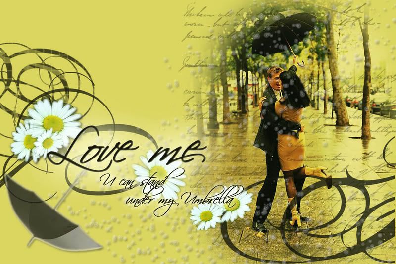
"Love me"

After learning all the skills of Photoshop, I'd like to create a picture by cropping, cutting, gadient , brushes, adding text ..... And with these pictures :


After more than 15 minutes, I got a new one with a Romantic emotion.
"Love me" by FuOnk and the quote : " U can stand under my Umbrella" is taken from my favorite song "Umbrella" ( by Rihanna )

Click here for bigger size: http://i8.photobucket.com/albums/a48/Slimzz/Phuong/94a6.jpg

Hope all of you like it!
Thanks for giving me some advises to make this picture more effective.

Sunday, November 11, 2007

PLaying with layers, filter, lighting, color and other effects in PS with photography :)

Like you guys know that I prefer to work on my photo. So I show what I play with my photo ^^ :).


This is the original one [I didn't resize, so it migh take a long time to load ^^]


And here is the result after I played with a lot of affect of PS ^^ [PS is so wonderful, fantastic and really my best friend ^^]

The background is blured. I used 2 layers: the one I blured is under another one. Then I use "mode clear" of brush to erase the background part on the layer which is not blured [the above one].


I added one more layer for the lips. This layer is under the layer which is not blured and above the blured layer.


Each layer is separated, so it's easy to edit every part of the picture.


And because the light where I took this picture was so nice, so we can see the picture's details very well :).


Photographer, model and also designer ^^: LYnn-Lee


Place: Apple room at RMIT Uni. Vietnam :D .


Camera: Sony ^^.


Tool: Photoshop :) .

Unbalance

I think I just leave it for your own opinion about this :)


Actually, I have no obvious idea for this picture.
My first idea for this was color arrangement around my photos. But after that something changed my mind to many other ways. Then I still used three colors for this design. And i still remember Maddy's talk in class about space, shape and contrast in class. So I finished it with this result ^^ :p.

Black and white; and NOTHING is WRONG


I just made it following my mind when I was doing other assignments ^^.
In my opinion, I think that NOTHING is WRONG, it's just RIGHT in other ways that some of us cannot see.
So I also think that never evaluate people or say they're right or wrong because they are always right on their own ways ^^. It's just said that beautiful or not beautiful for your own mind ^^.
And anyway PEOPLE ARE LIARS, hahaha! So... take it easy ^^!

Are we NOTHING or UNIQUE


As you can see "Are we NOTHING or UNIQUE".

In my opinion, I really thought about the faculty design we are studying and gonna work in the future.

I think that our pruduct is good or bad, that depends on so many value such as culture, religion and personal style.
So that I also think each person with their design is unique and there is its own value and beauty.

I also made it because of the thought about Maddy's talk in class about "contrast".

There is a lot of yellow thin sticks we can see clear in the purple dark background. However, they looked the same, while the small black dot in the middle of the picture, the red and the white lines; these colors do not make as big contrast as the yellow one; but it leads viewers to the text and think about the meaning of the picture.

Playing with color layer and my photo by PS

This is the color layer I created ^^
Hehe, this is my original photo ^^ :D ,
Then I put the color layer in front of the photo ^^


I decreased the opacity of some squares of color, then I used random some modes of photo image, mixed some effects and this is the result ^^ .

I really like blue color, so I use "color balance" to increase the level of blue color to have this below ^^.

My color!


It looks like that I cover the top part. But actually it's just effected by the level of color I put and the way I arrange 2 rows of color.


This was my feelings at that time, so I chose these cold color.


It looks quite sad but it also looks peaceful for me. And somehow it gives me the feeling of warm. Because sometime I need a lonely time, so I think a room with these color makes me cooler ^^ .


Those are just my feeling, opinion.


Hope some of you guys having something in common with me ^^ .


Friday, November 9, 2007

My design

Just do something Maddy told me in class. Copied some text, chose some colors, and put them together. Furthermore, I used some effects for my design.

I know it looks very simple. Maybe simple is good :)

You can check it


Photo Sharing and Video Hosting at Photobucket

I appreciate when you give me some feedbacks

Tuesday, November 6, 2007

dealing with colors

I hope that you will see the same color that i chose. I observed that following screens we do not see exactly the same colors.
I think that give a name to a color is a bit like express what you feel when you drink wine. A least, it is the same kind a text.
Then, i chose a blushing orangy golden, a light turquoise sea green cyan, a light magenta and a bluching bordeaux red.
I like bordeaux, it is the same color and name than wine.
After i chose my color, i wrote a text. I try different combinations of texts with colors. Then i layout it.
I did not want to add effect here as i wanted to limit the exercice to the choice of color, font and layout.


Monday, November 5, 2007

Cut and Join

Firstly, I find a nice car and cut it out


Soure: www.deviantart.com

Then, I take one more image to make the background


Soure: www.deviantart.com
My result :


I use some tool to make these one. I think pen tool is really useful tool in PTS when we want to cut something. It is also very interesting when we draw something like curve.

Different versions of Wing

I took this picture when I went to Singapore with my club on 6th September(RMIT Vietnam Ultimate frisbee Club), representing for our University to taking part in a largest Tournament of Asia: Singapore Open Tournament 2007. It was also the first time that I fly and I cannot forget that memory, that feeling. That's why this picture is meaningful for me.


Relax guys

hi, i saw all of you guys here did a good job, so today i posted this entry in order to make a small game. I hope all of you will feel relax after doing a lot of hard works. This game is quite easy, by using some Photoshop technicals that i learn from class ( and learn myself a little) i change 3 pictures of 3 famous actor in Hollywood, and i want to ask all of you guys : who are they ?


1/
2/
3/

Yeah, i hope it is not too difficult or not too easy to realise who are they. Tell me who you think ^___^

About the technics, in the first picture, i use "Motion blur" to blur it and then i use the "Twirl" function to make it like a wave. U can make the face become a circle with the "Twirl" function. In the second picture, i play with "Adjustments", change the Gradient map, mix some colour and change the exposure of this image.Finally, i use "Blur" function in Filter for the last picture but this time i use the "Smart blur" option. With a little change in number, i got it, it look like you draw by pencle right ?

Saturday, November 3, 2007

Have fun with Photoshop

I just want to explore some interesting things with Photoshop, so I did it to gain on more experiences.

First I chose a picture.

Photo Sharing and Video Hosting at Photobucket


After that, i used "Levels" tool and "Light Effects", and I have this picture

Photo Sharing and Video Hosting at Photobucket


In addition, I typed the word "Deja Vu", chose a font and edited type layer. Next I used "Liquify" to make some crazy things with the text. Furthermore, I used some brushes of Photoshop and made those streaks. Finally, I used "Text Effects" in "Styles" menu to fix the text again...and you can see my final design

Photo Sharing and Video Hosting at Photobucket

When I listened to a song, I heard the word "Deja Vu". After checking the definition, I decided to design something which related to that word. "Deja Vu" describes your feeling in a situation. You think that you have met the same situation in the past, but you haven't...and now you can check my design :D
I appreciate when you give me some feedbacks