
Horizontal photograph, with asymmetrical balance. What do you think about white space? Is it dominance?
Sunday, January 6, 2008
black and white balance
Posted by S.T.(s3111677) at 5:36 AM 0 comments
Friday, January 4, 2008
Happy New Year!
I use black and white as my decisive colors. Four small images at the edge are photograph which I took. Then I cut it and copy it. Finally, it becomes this shape. Quite amazing!
Posted by Xuan Huong at 3:01 AM 0 comments
Type exercise
 I use materials given by Maddy to practice layout skill. I think its disadvantage is that it has "rivers".
Posted by Xuan Huong at 2:45 AM 0 comments
Cropping PS - Lemonade
I use selection tool to crop these images and use gradient tool to make the background.
Posted by Xuan Huong at 2:33 AM 0 comments
Thursday, January 3, 2008
Themes
Girls Aloud's theme ( colorful version):
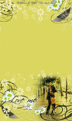
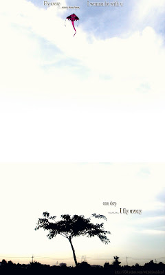
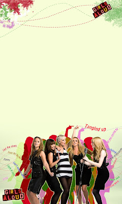 There are some themes I made for my 360 Yahoo blog in last 1 year. I love the band Girls Aloud, that why 3/5 themes of mine are their pictures :").
 If you want to design themes like that, it quite easy and I can help you to make one.
All these themes have the size 1200x2000 pixels. You should design the top theme (1200x400) and bottom theme (1200x800) in 2 different files. Then, combine these files into 1 and you will got the themes like this.
Girls Aloud's themes (Tangled up's style):
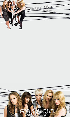
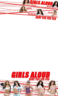
Other themes:
Posted by FuOnk at 10:21 AM 1 comments
Labels: themes
[24th] -:- Flash website for Viet Steel company
This is my final entry for blog so I decided to do something special. This is the result. The Flash website for Viet Steel company.
----- [Hope you enjoy it] -----
Posted by [S] at 10:01 AM 0 comments
Labels: [S] -:- Flash -:-
Subscribe to:
Comments (Atom)


